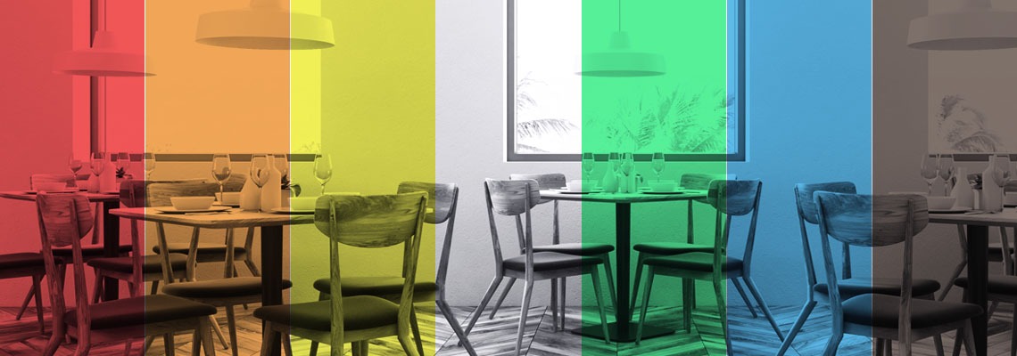
Understanding colour psychology – the study of how colours affect people – is, therefore, crucial for successful restaurant interior design.
To help you create outstanding restaurant designs, we break down colour psychology today. We will talk about everything you need to know about how colours play with people’s emotions and teach you how to use colours strategically in your restaurant. From colour selection criteria to the importance of colour psychology, we will walk you through the entire process.
What is colour psychology and why is it so important in restaurant design?
Interior design is a combination of art and science. To create successful restaurant designs, designers need to have a profound understanding of how different design elements play together to create aesthetically pleasing spaces. Above all, they need to understand the effect these have on diners. They need to know how to tap into the right senses to create dining spaces that cater to diners’ needs and help them connect with the space at a deeper level. Colour selection plays a huge role in achieving that.
In this context, understanding colour psychology becomes crucial. But what exactly is colour psychology and how does it help create outstanding designs?
Colour psychology, in the simplest terms, is the scientific study of how different colours affect people in different ways. Research shows that the colours in our surroundings can have a profound impact on our mood, feelings and behaviour. Understanding the psychology of colours, designers can learn to use colours strategically in their designs. Through careful selection and strategic use of colour, designers can not only make an interior space more appealing, but they can also put diners’ in the right mood.
Colour psychology in restaurant design. Finding your true colours
Colour is undoubtedly one of the most effective design mediums that allows you to have a positive influence on diners. As a result, understanding and applying colour psychology in the restaurant design process is crucial to ensure success. But what do you need to know about the effect of various colours? And what criteria should you take into account when selecting colours to use in your restaurant?
There are numerous criteria worth considering when selecting restaurant colours. When deciding on a colour scheme for a restaurant, designers and restaurant owners should take into account:
- The restaurant’s theme and cuisine. Surprising as it may sound, colours can even influence the taste of the food. Therefore, it is crucial to select colours that reflect the restaurant’s theme as well as the cuisine.
- The size and layout of the dining room. Colours do not only help make a dining room more appealing, but they can also make it look visually smaller or larger. Strategic use of colours can help make a small space look and feel larger, while darker colours can have the opposite effect.
- The desired atmosphere and ideal customer profile. Restaurant colours have a great impact on the atmosphere and ambience of the space. Therefore, when deciding on a colour scheme for a restaurant, designers and restaurant owners should have a thorough understanding of their ideal customer profile. They need to know what diners seek when they visit the restaurant and how they should feel once they are there.
Breaking down colour psychology. Get to know your colours
The colours used in a restaurant will undoubtedly have a transformative effect on the dining experience. Therefore, colour psychology deserves to have a central place in choosing an appropriate colour scheme for a restaurant. But to allow you to use colours to your advantage, you must understand the effect individual colours have on diners. To help you understand the psychology behind colours, we have created a short listing of commonly used restaurant colours and their effects on people.
Red
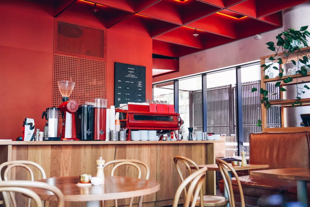
Red, in its many shades and tones, is known as a strong appetite stimulant that increases diners’ heart rate as well as their appetite. As a colour that makes people feel excited and energised, red can tempt people to eat more quickly, which can help increase table turnover rate. Consequently, red can be the perfect primary colour for fast-food restaurants and casual eateries. Used as an accent colour, red can bring excitement into the dining room, and as such, it might be the perfect choice for both casual and high-end restaurants.
Orange
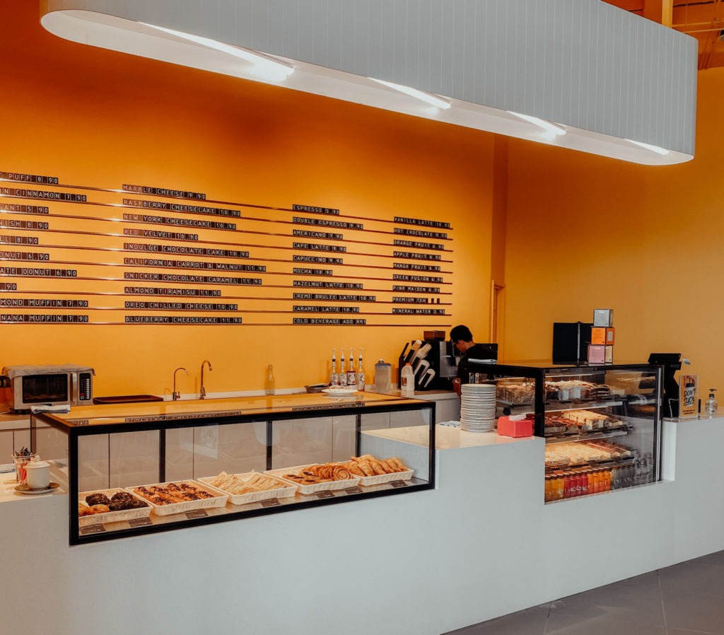
Orange is a popular choice in modern restaurant design. Coming in various shades and hues, orange is known as a colour that increases mental activity and makes people feel more comfortable. The warmth of this colour makes people feel more happy and cheerful. As a strong appetite stimulant, orange can be a perfect colour for fast-food restaurants, cafes, bistros and bars, and can be used as an accent colour in upscale restaurants.
Yellow
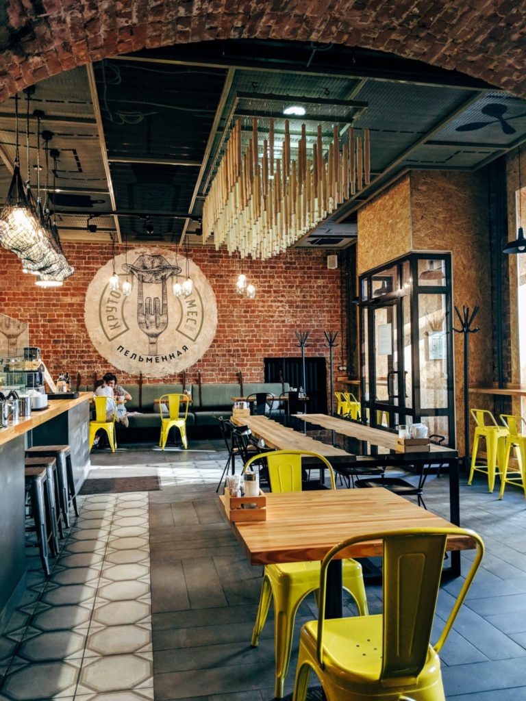
Yellow is a vibrant colour that is associated with energy and happiness. Bright yellow adds excitement and creates visual interest in the dining space. Colour psychology tells us that yellow has the power to make people feel more awake and energised. Since it is a very stimulating colour, yellow is a great choice for fast-food eateries, cafes and bistros, as well as more casual dining establishments.
Green
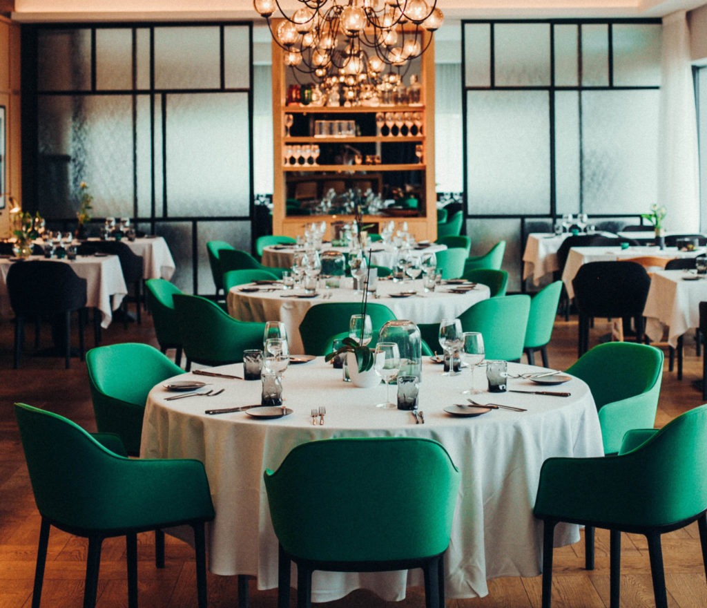
Green is a popular colour in many health-focused restaurants. Its soft, natural tone helps people relax and gives the space a feeling of freshness. Commonly found in nature, green is great for creating biophilic designs or to simply brighten up the space. Light green or mint green is a great choice for health-focused eateries, bistros, salad bars as well as for casual restaurants. Dark green, on the other hand, can add elegance and create a sense of intimacy, perfect for high-end restaurants.
Brown
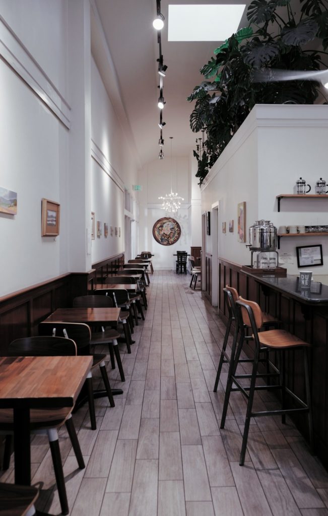
Brown is an often-neglected colour in restaurant design, due to its appetite suppressing effect. Nevertheless, various shades of brown can give the space a more natural look and helps people relax. Depending on the desired effects, brown can be efficiently used in coffee shops to remind people of the origin of coffee, but it can also suit contemporary bars, bistros and even upscale restaurants.
Blue
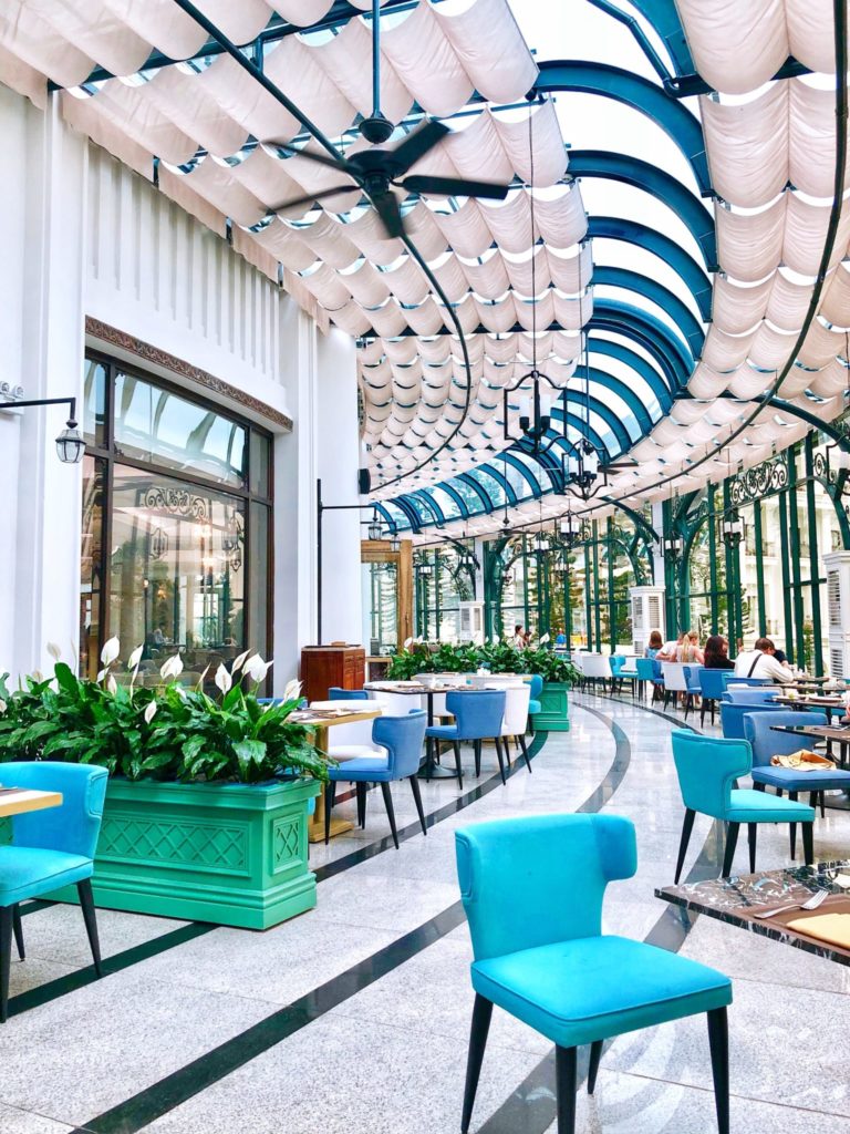
Besides brown, blue is another colour commonly avoided in restaurant design. Colour psychology indicates that blue tends to suppress appetite and makes people feel more thirsty and less hungry. Nevertheless, blue in its various shades from light pale blue to rich deep blue can be efficiently used in seafood restaurants, as well as in cafes and bars.
White
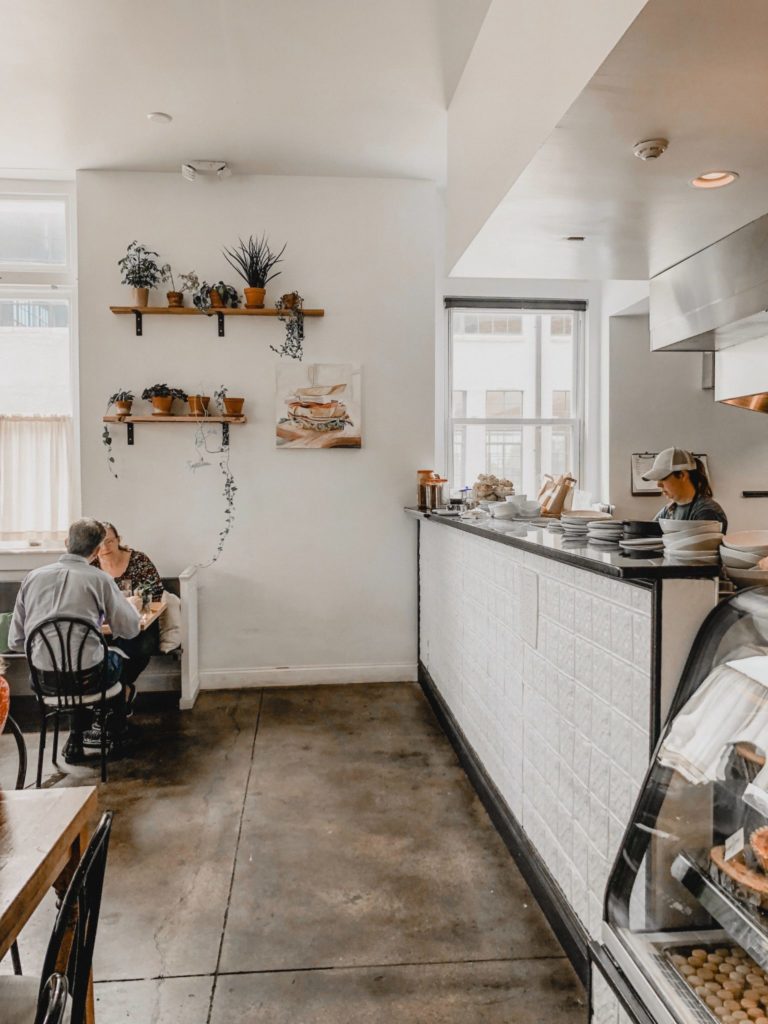
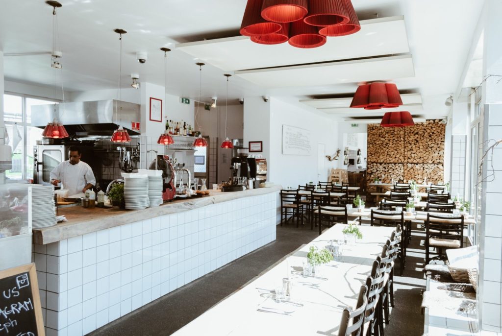
White and light beige colours are one of the most popular colours in restaurant interior design. Light colours make a small dining space feel larger and airer and can help make people feel more relaxed. Nevertheless, when using white as the main colour in a restaurant, it is crucial to balance it with bright and bold colours to avoid making the dining space look overly sterile.
Black
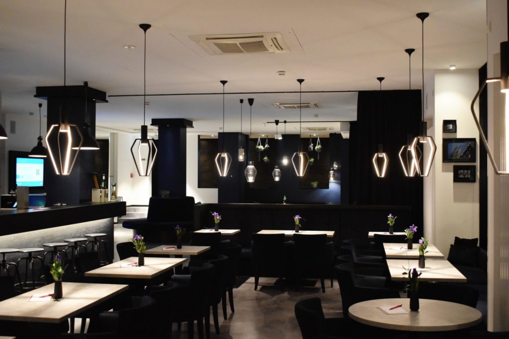
Black is a colour that is often used strategically to make other colours of the restaurant look more vibrant. As such, black allows designers to create strong focal points and draw attention to various design elements. Using a darker colour scheme might also help give the restaurant a more romantic and intimate feel, which is also the reason why black is common in many upscale and high-end restaurants. Similarly to white, black should be used in moderation, as an overly dark colour scheme can make the dining room feel smaller and more crowded than it is.
Final thoughts on colour psychology and restaurant design
Understanding colour psychology can help designers and restaurant owners create more captivating designs. Knowing how colours affect people’s perception and feelings towards the dining space can help create strategic designs that tap into the right senses of customers. A deliberate choice of colours and colour schemes help create the perfect restaurant atmosphere that invites and engages customers.
Nevertheless, when it comes to colour psychology and restaurant design, not everything is black or white. Restaurant design is all about balance and harmony, and that applies to all design elements not just to colours. While the effect of individual colours is easy to understand, it is the skilful combination of colours and colour schemes that will ultimately give the restaurant a unique identity.
Ready to discover the power of colour psychology in your restaurant? At Vision Shopfitters, we offer full restaurant design and refit services for restaurants of all types. Contact us today.
